I decided to represent the growth I’ve had the pleasure of experiencing this semester by creating the following vector advertisement:
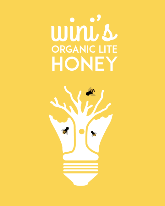
It is a company who’s name is inspired by Winnie the Pooh and my Grandma Wini who has that same sweet tooth. The design was not originally intended to be anything like that, even after I decided to pursue the hive-bulb idea. As I let my creativity lead the way, this was what I ended up with.
For a while I let the design lead me to a fairly complex place, one that was a bit overloaded and muddled. It wasn’t until I started considering the story that I was able to come up with the concept that led me to my final draft. My previous drafts weren’t bad, but they weren’t telling a story and I wasn’t okay with that. I feel that my final project accurately represents a story and much of what I learned this semester.

The one clear direction I had was to incorporate a lightbulb into my design. A few months back I came upon a website full of different interpretations of a lightbulb and ever since then, I’ve wanted to pursue a project centered around them. As I sketched, and looked at different work (the Lumineers have incredible gig posters), I sketched an idea with a beehive. As I started to execute on illustrator I realized that the best way to represent the hive would be Winni the Pooh style. In other words, through a tree. It just looked better. It also flowed well into my lightbulb shape.  After receiving some feedback (thank you, Brother Kerr) I determined that I needed to simplify the shape of the bulb. Instead of using the revolve tool to create dimension, I needed to focus on shape.


It took a long time to come with this simple solution to the bulb problem. I used strokes, tilted rivets, transparencies, etc. Finally, I was able to simplify to a shape I really loved. I used the shape tools, pen tools, shape builder tool- one of the most used tool on my palette- pattern tools, live trace, blend tool (quite a bit of it, actually), the align menu, etc.
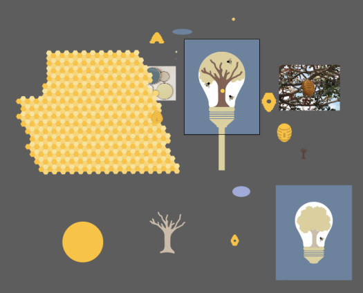
Clearly, I’m very organized. It took me a long time to decide the shape of the hive, what patterns I would-or ultimately would not apply-the color of the trunk, background, color scheme, etc.

Again, my process is the epitome of organization…or something like that. I also struggled to decide if the bulb would glow, what feel I wanted to present, and again, more trouble with that bulb and hive.
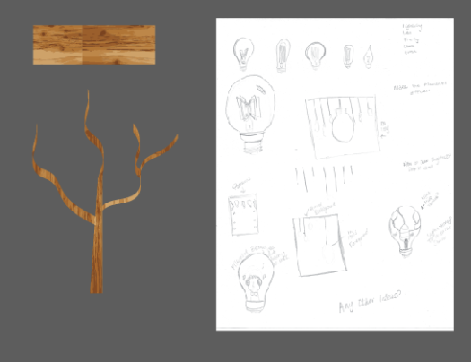 I was going to use a woodgrain texture to create my tree but it just looked really odd and it wasn’t worth pursuing. The good news? I got to play with live tracing which was a lot of fun.
 The design I ended up with was completely unexpected but I love it. I used the black as an accent to really emphasize the honey aspect and to create visual interest. I really think if I saw this in the real work, I would stop and look at it. It requires you to do so. It requires you to think, but it’s still so simple. I’m proud of the work I’ve done this semester and I’m so excited to keep building these skills.
On to the next one!


